Thursday, May 31, 2012

Happy Dad's Day

Okay, so it's not Father's Day quite yet.  I happened to have this set out and it worked for the sketch, so I made a card for my father-in-law.  One more and I'll be all set!  I used the SFYTT sketch for my card, and unlike the card itself which is early, I'm barely squeaking in for the challenge.  What can I say?  It's been a busy month and I kept putting it off.  Here it is finally!


link to sketch post
I used some patterned paper from the Bohemia collection by My Mind's Eye that I've had for a while, and I just did some simple stamping using my Dad's Day set.  (purchased at last year's used stamp sale)  It went together quite fast.

Stamps:  Dad's Day (Stampin' Up)
Paper:  Vintage Cream (Papertrey Ink); Bohemia: Backyard "My Journey" Brocade/Brown (My Mind's Eye)
Ink:  Dark Chocolate (Papertrey Ink)
Misc:  Designer Label punch (Stampin' Up); pop-dots

Friday, May 25, 2012

Black & White with a Splash of Chartreuse

I'm participating in the Papertrey Ink blog hop again this month.  I love the inspiration picture with its striking black, white, and chartreuse color scheme.  You absolutely must click the link to see the original blog post where this picture originated.  The outdoor dining area and tablescape is exquisite!  Seriously dreamy.  Did I mention that I love the colors?   :)

{photo credit}


Obviously, my card is directly inspired by the photo.  No one could possibly mistake it.  I layered white, black, and chartreuse mats just like the stack of plates in the photo.  I used my Background Basics: Geometric stamp set to create the patterned background.  (note to self:  must add the gingham set to my wish list)  I cut a beaded chartreuse circle using my Spellbinders dies and added a circle of black underneath to fill the little triangles.  It echoes that diamond print plate just a bit and helps the layer pop.  Then I simply stamped some chartreuse grass on the white circle using Honey Bees and stamped my sentiment in black over top.

I love the clean, contemporary result!  I envisioned this as a graduation card originally, but it would work for any important milestone.  I'm immensely proud of this card.  It turned out exactly the way I hoped.  My oldest son graduates from high school in two weeks and the quote captures my feelings right now.

"This moment contains all moments."  C.S. Lewis

All moments.  Eighteen years of individual moments.  Accumulated moment by moment to create this life-changing moment.  How could I possibly say it better?

Stamps:  Background Basics: Geometric; Honey Bees; Remember (Papertrey Ink)
Paper:  White, True Black, Simply Chartreuse (Papertrey Ink)
Ink:  Simply Chartreuse (Papertrey Ink); Tuxedo Black (Memento)
Misc:  Beaded Circles die, Standard Circles dies (Spellbinders)

Saturday, May 12, 2012

There She Goes Blog Hop

Welcome to my stop in the 3rd annual Mother of All Blog Hops sponsored by There She Goes.   Over the next two days, customers and members of the design team will be featuring some of their favorite There She Goes stamp sets.   You also have a chance to win some fabulous prizes!  To find out how, please go to the There She Goes’ blog and read the simple instructions.


I was given the privilege of featuring the Home Sweet Home stamp set.  Good thing too, because that set and its matching additions are the only There She Goes stamps I have so far.  lol  Most of the images on my card come from the main set, but the brick pattern is part of the Holiday Additions set.  If you get one, you simply must have the others!

I kept my card pretty simple.  I colored and cut out the fireplace, logs, clock, and flower vase, and then put them on a dark brown card base.  I like how it pops.  The sentiment banner is curved slightly to add a little dimension to the card.  (Please pardon the indoor, poorly-lit photo.  Let's just say it's been a day and leave it at that!)

If you want to see another card using this set, just scroll down to the post before this one.

Stamps:  Home Sweet Home, HSH Holiday Additions (There She Goes)
Paper:  Dark Chocolate, White, Vintage Cream (Papertrey Ink)
Ink:  Rich Cocoa (Memento)
Copic:  0, T1, T4, T6, E000, E30, E42, Y11, Y13, Y15, YR15, YR18, E55, E57, E59, YG23, YG25, YG91, YG93
Misc:  Double-Ended Banner die (Papertrey Ink)

So there you have it!  Click on the InLinkz below and follow it to the next blog in the hop.  Have fun!

Saturday, April 28, 2012

Home

Whew, I got my sketch challenge card done before the end of the month!  I was cutting it close a wee bit there.  I don't have many There She Goes sets (the company who is the sponsor this month), but I do have these wonderful fireplace building sets with additions for fall holidays.  The details are fantastic!  I chose to use the stone fireplace for my card.


(linked)

I wanted a rustic feel, so I chose Ocean Tides for my card base and some coordinating muted patterns for the background strips.  The fireplace stones were colored to match.  It's a little unusual, but I really like the pop of color.  Both the fire and the clock were stamped on a separate piece of white and then cut out and glued in place.  The word "home" is actually part of a longer sentiment, but I just selectively inked the one word.  Fits perfectly!

Stamps:  Home Sweet Home, Home Sweet Home Holiday Additions (There She Goes)
Paper:  Ocean Tides, White (Papertrey Ink); Marjolaine 6x6 pad (Basic Grey)
Ink:  Tuxedo Black (Memento)
Copic:  0 Colorless, C1, T1, T4, T6, E30, E41, E42, E55, E57, E59, Y11, Y13, YR15, YR18, BG72, BG75, BG78
Misc: Standard Circles die (Spellbinders)  

Wednesday, April 25, 2012

Stripes, Damask, and Roses

Today is the monthly Papertrey Ink blog hop.  (linked above)  One of my 2012 stamping goals is to participate every month and so far this year I have succeeded!  I also just realized that I have already surpassed last year's total posts and it's only April.  I'm quite proud of myself!  Here's to a year full of stamping adventures!
Just like last month, the PTI blog hop is an inspiration challenge.  (click photo for credits)  I really love the soft vintage fabrics in the picture, not to mention the pretty pastel colors.  I started my card by stamping stripes on my white card base, and then attached a strip of stamped damask at the bottom.  Both were done in Spring Rain ink.  I used my Swiss Dots embossing folder for the narrow strip of white cardstock.


The most time consuming part of the card was cutting out all the flowers and leaf sprigs.  I stamped the rose with Hibiscus Burst ink on white cardstock.  The other flowers were stamped with the same ink on the matching cardstock to get a delicious two color effect.  The inspiration for that came from one of the floral fabrics in the picture.  The leaves were stamped with Lucky Limeade ink on white cardstock and then painstakingly cut out with a craft knife.  I definitely need to add the matching dies to my next PTI order.  It took way too long!

As a last little touch, I added small light pink rhinestones to the center of the two-tone flowers.  I considered adding some glitter to the roses, but by then I had already glued everything to the card.  Next time!  I used a sentiment from Women of Life to finish it off. Voila - a sweet Mother's Day card!

(one little side note:  my printer rendered the pinks a much softer hue, thus my pinks are not quite as bright as the inspiration photo shows on screen)

Stamps:  Garden of Life, Distressed Stripes, Damask Designs, Turning a New Leaf, Women of Life (Papertrey Ink)
Paper:  White, Hibiscus Burst (Papertrey Ink)
Ink:  Spring Rain, Hibiscus Burst (Papertrey Ink); Lucky Limeade (Stampin' Up); Tuxedo Black (Memento)
Misc:  rhinestones (Studio 18); Swiss Dots embossing folder (Cuttlebug)


Friday, April 20, 2012

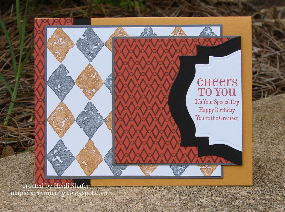
Cheers to You

I wasn't too productive in the studio this week.  I worked on this particular card on and off one day while doing other chores.  I'd get stuck, go do something else, come back to make some headway, and then repeat the whole process.  Just one of those days!


I used a color combo from the ColourQ #133 challenge this week.  (picture linked)  I thought the colors would make a great masculine card.  Drawing inspiration from the geometric diamond shapes, I used my markers to stamp a More Mustard and Basic Gray background on the white panel, and then my Basic Gray inkpad to stamp a smaller diamond pattern on the Dusty Durango panel.  It looks simple, but it took all day playing around with layers before I finally settled on this design.  I'd change a few small things if I were to do it again, but it's still a fun masculine birthday card!

Stamps:  Print Pattern, Lots of Thoughts (Stampin' Up); Background Basics: Retro (Papertrey Ink)
Paper:  Dusty Durango, More Mustard, Basic Gray, Basic Black (Stampin' Up); White (Papertrey Ink)
Ink:  Dusty Durango, Basic Gray (Stampin' Up)
Markers:  More Mustard, Basic Gray (Stampin' Up)
Misc:  Labels 18 dies (Spellbinders)

Wednesday, April 18, 2012

Well, how about that?

I was chosen as a ColourQ Courtier for last week's challenge! You can see the list on the ColourQ blog here. I totally didn't expect that! The colors just caught my eye and I decided to play along. What a sweet surprise! Just scroll down to my last post or click here to see my cards. I love this week's colors as well so I hope to get back in the studio soon. Just had to share!!!